Evolution of the Skoda Logo
1895 – 1905
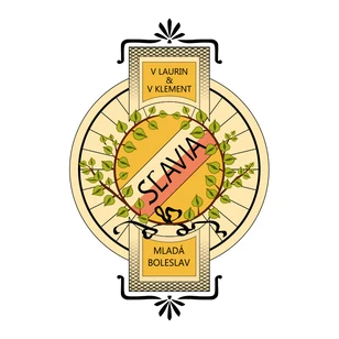
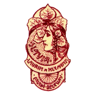
The very first version of the logo was a label on the handlebars of their bicycles. The lime flower was a symbol of Slavic nationality and freedom. In the lower part of the logo – underneath the brand name – were the two names, Laurin and Klement and the production location – Mladá Boleslav. This logo was also often used in various print materials.
1905 – 1911
This version of the Slavia logo was placed on the side of the petrol tanks of the L&K motorcycles. The logo has obviously changed. Nevertheless, L&K and Mladá Boleslav still remain.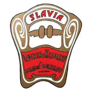
1905 – 1929
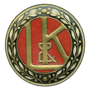
The first version of logo bearing the Laurin & Klement name is used during the 1905 – 1925 period. The groundwork consists of the initials of the founders and original owners. Inside the logo, a laurel wreath has been incorporated for the first time, as a symbol of success.
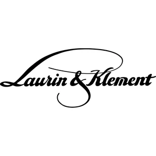
The typographical variant of the Laurin & Klement logo was used between 1913 and 1929. The inspiration for this style came from the Art Nouveau creative artistic style, as a new approach to art and life in general. We can see a quest for a modern society and its greater visual appearance – an effort to follow up on latest trends and be part of new world era philosophy.
It is for its elegance and style that this typographical logo is still placed on some high-end, luxury Škoda models, even to the present day.
1925 – 1934
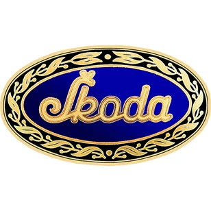
An oval shaped logo with a blue background with Škoda typography appears for the first time. From the merger with the Škoda company in 1925 up until 1929, the logo was placed on the front of Škoda cars alongside the Laurin & Klement typographical logo version. Later, the oval shaped logo is used parallel to the registered trademark – the winged arrow.
1926 – 1993
The first version of the famous winged arrow appears in Pilsen in 1923 and in its various modifications through time, still appearing on Škoda automobiles until 1995. Despite little being known about the designer, probably inspiration for the logo was a plaque with a picture of a Native American man wearing a feather headband. From this picture, the variant with five feathers was drawn, later the graphically clearer variant with three feathers over the winged arrow was used as standard. The elements of the winged arrow logo are apparent – technically and aesthetically elaborated, the dynamics of flight as the aim to keep moving forward, precision in production.
The winged arrow was not only used on cars and replacement parts, but also in Škoda’s print materials.
In 1937, Škoda typography accompanies the winged arrow in the logo. The most commonly used colour variants were silver and blue; in the 1950s and 60s, red or inverse variants are also incorporated.

1993 – 2011
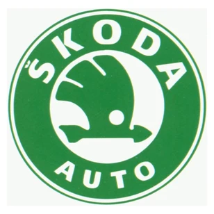
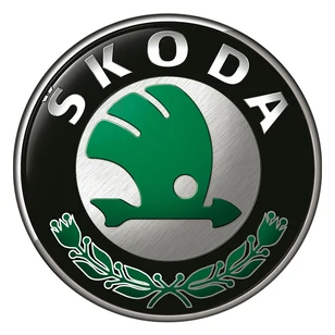
Not long after Škoda merged with the Volkswagen Group, a new version of the car producer’s logo was created. The blue colour was replaced with green, the winged arrow itself is surrounded by a wide circle with Škoda inside. Since 1994, the main logo colours have been black and green. On all the models, the logo is placed on the front of the car, as well as appearing on the steering wheel, the back door and discs of all the tyres.
2011 – 2015
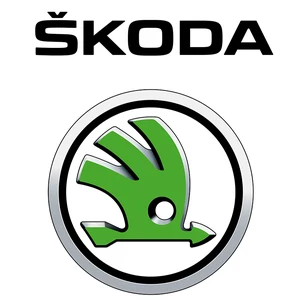
The logo is refreshed once again. The outer area – the wide circle – is eventually replaced by a much thinner silver chrome circle. This change in design provides more space for the winged arrow, which in effect becomes much more prominent. The Škoda font is also new and placed above the logo. In the following months, the lines and hatch of the logo are fine tuned.
2016 - 2022
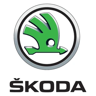
The only change has been the Škoda typography moving to below the logo with the winged arrow. Despite its long evolution and changes made to the logo, the original idea of the winged arrow is still prevalent and at the very centre of the company logo. It is visually appealing yet traditional; modern, yet still reflects the company’s 120-year heritage.
From 2023
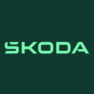
The company will now use the Škoda name and traditional winged arrow in a ring more separately, with the name becoming the main communication tool. The new styling uses entirely different typography based on symmetry and a combination of round shapes with borders. The most challenging element was integrating the caron above the S, which represents an important part of Škoda’s Czech heritage. The so-called háček is now integrated into the first letter. The research found that the typographic wordmark is easier to recognise and identify.
